I’ve recived a confirned news about the lukewarm response to the free MicroStrategy Reporting Suite and MicroStrategy, Inc is getting desperate for License revenue. This is forced them to re-launch the free Reporting Suite. They have hired a battary of paid news sites, which is obvious with all BI product vendors. But the lukewarm response has forced them to relaunce the free suite once again after the initial launch. BTW, the price of v9 is strangely not much.
Monthly Archives: June 2009
Logical views with MicroStrategy
Business intelligence architects have always relied on the Datawarehouse team to create database views or perform datawarehouse changes in order to construct the BI architecture. If something was not architected as desired, then the BI developers were forced to request these changes, and then wait for their completion before moving forward. Since MicroStrategy 8, BI developers have had the ability to create logical tables and table aliases to circumvent this process. This article will go through various examples on how this can be used on an implementation.
Lookup Tables and Reuse of Dimensions – The most obvious reason for requiring logical tables or aliases is for the creation of lookup tables or reuse of dimension tables. First off, the difference between an alias and a logical table is that an alias is an exact copy of a dimension table, and if the dimension table or alias changes then both will change. The logical table on the other hand is a custom SQL statement that utilizes any table available to the BI developer. Lets say we have a fact table F_FACT, that stores 3 products per transaction, but the data model only has one D_PRODUCT table. Aliasing allows us to alias D_PRODUCT into D_PRODUCT_1, D_PRODUCT_2, and D_PRODUCT_3, so that we now have 3 separate tables to join to F_FACT. Now, lets say that the 1st product is a laptop, the 2nd product is a battery, and the 3rd product is an AC Adapter. We could still join F_FACT to the 3 aliased product dims, but we also want only laptops to show up in D_PRODUCT_1, only batteries in D_PRODUCT_2, and only AC Adapters in D_PRODUCT_3. This is where logical tables can come in to play. First, lets create a logical table called D_PRODUCT_LAPTOPS which we create with the following SQL statement, ‘SELECT * from D_PRODUCT where PRODUCT_TYPE = “LAPTOP” ‘. Quite simply, we have created our own dimension table of laptop products without additional support from the EDW team.
Case Study: Using Logical Views to make a Fact table from a Dimension – Lets say we have a dimension table called D_EMPLOYEE with the fields employee_key, employee_id, employee_name, record_start_date, record_end_date, employee_start_date, employee_end_date, and organization.

Now, lets say we want to be able to count Active and Terminated employees from a fact. Our first problem is that D_EMPLOYEE is a type 2 dimension, so we need to pull only the latest record on this dimension. For the metric, we have the option of building the count of active and terminated employees either on the fact table or by building a fact object in MicroStrategy. For this demonstration, we will build the counts on the fact itself.
In order to pull the latest record from D_EMPLOYEE, we will use the following WHERE condition: WHERE RECORD_END_DATE = ‘12/31/9999′ or RECORD_END_DATE = EMPLOYEE_END_DATE which will pull the latest record for each employee.
For the facts, we will add the following fields to the SELECT part of the query: CASE WHEN RECORD_END_DATE = ‘12/31/9999′ THEN 1 ELSE 0 END as ACTIVE AND CASE WHEN EMPLOYEE_END_DATE is not null THEN 1 ELSE 0 END as TERMINATED.
The Final Logical table will look as follows, and now we have a new fact table.

Case Study: The POOL technique – Once you start to use Logical table , you will start to see that this can be a very powerful tool that can accomplish a great deal, as long as performance allows it. Please note that these table Views just serve as queries on the database, and are not materialized in anyway. What I often do after creating a complicated logical view is run it through a query tool like Toad. If it does not return results immediately, then I send the query off to our DBA to see what they can do.
The POOL technique (which I’ve named it) is actually a technique for developing complex SQL reports when there are no data warehouses or BI Tools. The point here is that you can use this technique to develop a complex piece of SQL, and then use that SQL in a MicroStrategy logical view, so you can build metrics and attributes on top of that SQL. This technique is also great for developing Freefrom SQL queries in MicroStrategy.
The concept is simple. First develop a query that gets you as far as you can with the base tables, and then use that query as the base table for a new query. Repeat until you have what you need. One other point is to try to avoid Sub Selects as much as possible because they can seriously slow down performance.
Lets use the table D_EMPLOYEE above and the logical view F_EMPLOYEE as our basis. The report we want to create is a list of active employees, their current organization, and the number of organizations they’ve been in. If the number of organizations is greater than 5 then we want to mark this record as a MOVER.
First, we build SQL to get as far as we can. I don’t put the number of Organizations in this query for illustrative purposes, but do you see how to calculate number of Organizations in this query without a sub Select?

Next we use the statement just created as the base table for the next select, and name this base table POOL. We then create a query based on POOL which now calculates the Number of Organizations.

Now we use the SQL statement above for our base table, and call that table POOL2. We do this to add the MOVER field to the report.

We can keep going if we had more complex requirements, but the point is that this technique can be used to develop complex queries, which we can then plop into a MicroStrategy logical tables. Maybe we will create an attribute called MOVER? The options are now far greater with logical tables.
Customizing Narrowcast XSL
In Narrowcast Server, when you use report in EXCEL document, instead of normal report output; you can customize the output result based on your own design by modifying default Narrowcast XSLT.
In order to design Narrowcast XSLT, first we need to understand the Report XML and its content present in XML file.
How to get the get the report xml:
- Run the corresponding report in the WEB.
- In the Address Bar, enter ‘&XML=1’ at the end of the URL as shown below.
- Right click in Browser and Select the ‘ViewSource’ option.
- Search for ‘<mi’ in the Source and starting from the ‘<mi’ tag copy till end tag (i.e) ‘mi>’.
- Paste the copied text in notepad and save it in ‘.xml’ file.
Note: Report data Tag starts with <RH>
Narrowcast XSLT’s and Tags specific to spreadsheet
Note: All aspects of this XML specification, including element (tag) names, attribute names, and attribute values are case sensitive. •
- The pt-container is the root level of every Excel XML document element that contains the table tag. This tag is required.
- The table tag contains both content and formatting tags for turning data into a well-formatted grid. The resulting grid overwrites a contiguous rectangle of cells in an Excel workbook when an Excel document is rendered. An Excel XML document element can contain only one table tag.
- The fonts tag contains the set font definitions that control the font characteristics of cells written into the Excel workbook. Font definitions include font type, color, size, weight, and modifiers like italic. An Excel XML document element can contain only one fonts tag.
- The font tag contains the definition of a specific font used for this document element. Zero or more font tags are required.
- The styles tag contains the set style definitions that control cell formatting for cells written into the Excel workbook. Style definitions include all font characteristics as well as background color, orientation, alignment, and borders. An Excel XML document element can contain only one styles tag.
- The style tag contains the definition of a specific style that is used for this document element. Zero or more style tags are required.
- The formats tag contains the set of format strings that are used to format date, time, and numeric cell contents. An Excel XML document element can contain only one formats tag.
- The format tag contains the definition of a specific format string that is used for this document element. Zero or more format tags are required.
- Each row in a table contains cells. A blank row can be represented by the inclusion of a row containing an empty cell. One or more row tags are required.
- Each cell in a row contains the data that should be placed into the corresponding cell in the resulting grid. One or more cell tags are required.
Sample Report output and used to design the XSL
| Country | Region | Revenue |
| USA | Northeast |
$2,334,864 |
|
|
Mid-Atlantic |
$3,413,340 |
|
|
Southeast |
$2,016,186 |
|
|
Central |
$1,773,270 |
|
|
South |
$1,380,991 |
|
|
Northwest |
$1,485,182 |
|
|
Southwest |
$2,816,334 |
| Web | Web |
$1,716,267 |
Sample XSL created for the above Report (you can take default Narrowcast XSL and Modify the content except parent tags)
Output for the above Report along with the XSL
1) Save the above XSLT
2) Insert the XSLT as XSL file in Narrowcast Server
3) In the documents, while mapping report in EXCEL document; Map this XSLT for the particular report
4) complete the service (as we do normally)
5) Run the service, you will get the customized output

Narrowcast XLST output
Narrowcasting Dashboards through email
Last year, our group was tasked with developing a MicroStrategy dashboard that was to show Daily, Weekly, and Monthly views of the business from 5 different perspectives. The dashboard was to contain 30 reports each with about 3 to 15 rows of data and 10 columns. The dashboard was to run nightly and needed to be e-mailed to about 75 executives. This was THE report for the enterprise. Every solution we came up with was developed all the way through and tested only to find out that there would be file size and report performance problems. This article will describe each approach, and will finish with the selected solution.
Our initial approach was to attempt to provide the most pleasant user experience possible by building an interactive Flash dashboard. For two weeks we worked through the dashboard development, layering panel after panel, placing report upon panels at various levels, and manually formatting each and every pixel. The end product was both interactive and pleasing on the eyes. We thought we were merely steps away from completion. We then began testing our product by emailing the dashboard through Narrowcast. We quickly noticed that the dashboard e-mail was 2 MB, and took about 10-15 seconds to load. The size of the e-mail was a bit larger than we would have liked, and 10-15 seconds of wait time was unacceptable. The solution was quickly dumped, and we started to look at our options.
Excel or PDF attachments are always a great option when narrowcasting reports, and the size of these documents are very efficient. However, this dashboard was required to be viewed directly from the e-mail mainly because of the audience that it was built for. Shown below are the options in Narrowcast for what can be included in the body of an e-mail.

Our next option was to use Report Service documents, and if that failed we would try out HTML document solutions. Both options were tried, and although they did deliver the reports in an acceptable format, the file size of the dashboard was still between 1 and 2 MB. The problem with load time had been solved, but the dashboard was still just a bit larger than desired. (a Narrowcasted excel attachment of the reports only totalled 100kB)
It was at this time that we started working directly with the Narrowcast server document (the first option in the picture above). What we found is that server documents are very easy to create. Basically they involve inserting grid reports onto a blank template as show below:

The end result was a very nicely formatted dashboard/e-mail with a file size of around 800kB.
Although we could have lived with this result, we still felt there was room for improvement. We knew from experience with other BI tools that similar e-mailed reports were coming through at half the size, so we wanted to investigate a little bit more. What we found were 2 more settings that could be applied. First off, under the Advanced Properties of each document object, there was a setting to ‘Improve performance by not preserving the grid reports formatting’, as shown below:

Next from each report object’s Document Element Properties, there is a place to specify your own style sheet, which your Narrowcast server should have access to. It is this setting that will give your report more formatting then just text. See the picture below that shows we picked the stylesheet called ’Squares’.

With these changes, we were able to get the e-mail down to 400kB, and acceptable size, and even a bit better than we expected. I realize this is alot of detailed technical information, but hopefully, this case study shows the various options of emailing with the Narrowcast server. If the report does not need to be directly viewable in the e-mail’s body, then attachments are definitely the best way to go, but otherwise, I’m pretty sold on using Narrowast Server documents with style sheets.
What’s new in Microstrategy Dashboard ?
Introduction: The designer can create more flexible data presentations with dashboards than with documents, since more users can be served with a single dashboard. Each user can interact with the dashboard to display only the subset of data they are interested in (using panels and selectors) or only specific attribute elements or metrics (using a selector)

What is a dashboard?
A dashboard is a display of related sets of data on one screen. A dashboard is commonly used to assess company or personal performance work or work group contributions to overall goals of the business. Dashboards summarize key business indicators by presenting them in visually intuitive, easy-to-read, interactive documents.
Provides interactive functionality so users can change how they see the data. Used online rather than printed out.
While Designing Dashboard , you can choose selectors, widgets, panels, and other controls, to create a personalized, custom dashboard that suits your user’s specific needs. Various formatting options such as gradient colors and 3D effects also help you create dashboards with a style appropriate for the boardroom.
Adding interactivity to dashboards:
A key aspect of a dashboard is the interactivity it allows. Interactivity lets analysts dynamically change the data displayed in Grid/Graphs or change other objects on the dashboard.
- Button bar
- Analyzing ranges of time: Slider
- Analysis at a glance: Gauges, thermometers, cylinders, funnels
Gauges 
Thermometer

Organizing interactivity features on a dashboard
The result of a user’s interactive selections can affect multiple objects simultaneously. You can design this using a panel stack, which is a collection of panels, each of which can contain groups of objects. Panels help you display only those groups of data that should be seen at the same time.Additional features let the user navigate between panels, and quickly change the display of data within a panel.
Panels and panel stacks
Text field, line, rectangle, image, panel, panel stack, selector, or Grid/Graph object are controls and grouped together put into a place holder is called panel.
A panel stack is a collection of individual panels, stacked on top of each other. Example of Panel Stack
panel stack to provide the Corporate, Regional, and Detail Data “views.” Each view is an individual panel in the panel stack.
Selectors
A selector can be displayed as a button bar, a drop-down list, radio buttons and much more..

Title bars
A title bar is simply an area across the top of a panel stack or Grid/Graph.
- The title identifies the panel, panel stack, or Grid/Graph.
- The buttons allow users to minimize and maximize Grid/Graphs in MicroStrategy Web.
Quick switch
Quick switch is a button that allows an analyst to quickly change a Grid/Graph from Graph view to Grid view and back, with a single click.
Widgets
A widget is a type of Report Services control that presents data in a visual and interactive way. You can think of widgets as interactive Flash-only graphs that dynamically update when you select a new set of data to view. The dashboard user can even interact with some types of widgets to manually select a set of data to analyze. A variety of widget types, such as Gauge, Heat Map, and Stacked Area widgets, are available for use in MicroStrategy dashboards.
Graph styles for dashboards
•Gauge •Funnel •Area •Vertical stacked bar •Combination: Line and horizontal bar •Bubble •Pie
Important points to be consider in the interactive dashboards:
- Layering data on dashboards: Panels & Panel Stacks
- Providing interactivity to users: selectors
- Enabling Grid/Graphs to control other Grid/Graphs
- Providing Flash analysis and interactivity: widgets
- Enabling transition animations in Flash
- Adding title bars to Grid/Graphs
- Quick switch for Grid/Graphs
- Drilling in documents
Layering multiple dashboards in a single document
It is similar to having tabs created in one web page. It used call Page Bys in the earlier versions of Microstrategy like having Corporate level , Regional level ..
Defining a selector
DHTML style Selectors

Flash Style is how the selector is displayed in Flash Mode in MicroStrategy Web
- Automatic: Default DHTML type even in the flash style
- Fish Eye Selector: An interactive style of selector that is displayed only in Flash Mode. It magnifies an item when a user hovers the cursor over it. This style of selector is useful because it allows a user to choose from a large list of elements without having to see all of the elements displayed at once

- Action Type determines whether the selector displays elements, metrics, or panels.
In non-Flash modes in MicroStrategy Web, a Fish Eye Selector can display as a Grid/Graph (if it was created as a widget) or as a standard selector such as a listbox or button bar (if it was created as a selector).Selector items of a Fish Eye Selector with images instead of Names.
Design View

Understanding and working with widgets:
- Bubble Grid: Bubbles of different colors and sizes representing the values of two metrics.
- Cylinder: A simple status indicator that displays a vertical cylinder with fluid in it. The level of the fluid within the cylinder is a visual representation of a single metric value.
- Data Cloud: A list of attribute elements displayed in various sizes to depict the differences in metric values between the elements.
- Fish Eye Selector: An interactive selector that magnifies an item when you hover the cursor over it. It allows a user to choose from a list of attribute elements, metrics, or images without having to see all of the elements, metrics, or images displayed at once.
- Funnel: A variation of a stacked bar chart that displays data that adds up to 100%. It allows a user to visualize the percent contribution of a metric to the whole.
- Gauge: A simple status indicator that displays a needle that moves within a range of numbers displayed on its outside edges.
- Graph Matrix: A group of area graphs that display actual values and line graphs that display forecasted values. It allows a user to quickly analyze various trends across several metric dimensions.
- Heat Map: A combination of colored rectangles, each representing an attribute element, that allow you to quickly grasp the state and impact of a large number of variables at once.
- Interactive Bubble Graph: A conventional bubble plot that allows you to visualize the trends of three different metrics for a set of attribute elements.
- Microcharts widget :The Microcharts widget consists of compact representations of data that allow analysts to
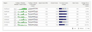 quickly visualize trends in data.

Mainly lot of the issues had been fixed & introduced easy way handle interactive dashboards. Previous versions we used create & configure using SDKs now it gives very powerful interactive dashboard.
Please feel free to ask me any questions you may have to explain.