Introduction: The designer can create more flexible data presentations with dashboards than with documents, since more users can be served with a single dashboard. Each user can interact with the dashboard to display only the subset of data they are interested in (using panels and selectors) or only specific attribute elements or metrics (using a selector)

What is a dashboard?
A dashboard is a display of related sets of data on one screen. A dashboard is commonly used to assess company or personal performance work or work group contributions to overall goals of the business. Dashboards summarize key business indicators by presenting them in visually intuitive, easy-to-read, interactive documents.
Provides interactive functionality so users can change how they see the data. Used online rather than printed out.
While Designing Dashboard , you can choose selectors, widgets, panels, and other controls, to create a personalized, custom dashboard that suits your user’s specific needs. Various formatting options such as gradient colors and 3D effects also help you create dashboards with a style appropriate for the boardroom.
Adding interactivity to dashboards:
A key aspect of a dashboard is the interactivity it allows. Interactivity lets analysts dynamically change the data displayed in Grid/Graphs or change other objects on the dashboard.
- Button bar
- Analyzing ranges of time: Slider
- Analysis at a glance: Gauges, thermometers, cylinders, funnels
Gauges 
Thermometer

Organizing interactivity features on a dashboard
The result of a user’s interactive selections can affect multiple objects simultaneously. You can design this using a panel stack, which is a collection of panels, each of which can contain groups of objects. Panels help you display only those groups of data that should be seen at the same time.Additional features let the user navigate between panels, and quickly change the display of data within a panel.
Panels and panel stacks
Text field, line, rectangle, image, panel, panel stack, selector, or Grid/Graph object are controls and grouped together put into a place holder is called panel.
A panel stack is a collection of individual panels, stacked on top of each other. Example of Panel Stack
panel stack to provide the Corporate, Regional, and Detail Data “views.” Each view is an individual panel in the panel stack.
Selectors
A selector can be displayed as a button bar, a drop-down list, radio buttons and much more..

Title bars
A title bar is simply an area across the top of a panel stack or Grid/Graph.
- The title identifies the panel, panel stack, or Grid/Graph.
- The buttons allow users to minimize and maximize Grid/Graphs in MicroStrategy Web.
Quick switch
Quick switch is a button that allows an analyst to quickly change a Grid/Graph from Graph view to Grid view and back, with a single click.
Widgets
A widget is a type of Report Services control that presents data in a visual and interactive way. You can think of widgets as interactive Flash-only graphs that dynamically update when you select a new set of data to view. The dashboard user can even interact with some types of widgets to manually select a set of data to analyze. A variety of widget types, such as Gauge, Heat Map, and Stacked Area widgets, are available for use in MicroStrategy dashboards.
Graph styles for dashboards
•Gauge •Funnel •Area •Vertical stacked bar •Combination: Line and horizontal bar •Bubble •Pie
Important points to be consider in the interactive dashboards:
- Layering data on dashboards: Panels & Panel Stacks
- Providing interactivity to users: selectors
- Enabling Grid/Graphs to control other Grid/Graphs
- Providing Flash analysis and interactivity: widgets
- Enabling transition animations in Flash
- Adding title bars to Grid/Graphs
- Quick switch for Grid/Graphs
- Drilling in documents
Layering multiple dashboards in a single document
It is similar to having tabs created in one web page. It used call Page Bys in the earlier versions of Microstrategy like having Corporate level , Regional level ..
Defining a selector
DHTML style Selectors

Flash Style is how the selector is displayed in Flash Mode in MicroStrategy Web
- Automatic: Default DHTML type even in the flash style
- Fish Eye Selector: An interactive style of selector that is displayed only in Flash Mode. It magnifies an item when a user hovers the cursor over it. This style of selector is useful because it allows a user to choose from a large list of elements without having to see all of the elements displayed at once

- Action Type determines whether the selector displays elements, metrics, or panels.
In non-Flash modes in MicroStrategy Web, a Fish Eye Selector can display as a Grid/Graph (if it was created as a widget) or as a standard selector such as a listbox or button bar (if it was created as a selector).Selector items of a Fish Eye Selector with images instead of Names.
Design View

Understanding and working with widgets:
- Bubble Grid: Bubbles of different colors and sizes representing the values of two metrics.
- Cylinder: A simple status indicator that displays a vertical cylinder with fluid in it. The level of the fluid within the cylinder is a visual representation of a single metric value.
- Data Cloud: A list of attribute elements displayed in various sizes to depict the differences in metric values between the elements.
- Fish Eye Selector: An interactive selector that magnifies an item when you hover the cursor over it. It allows a user to choose from a list of attribute elements, metrics, or images without having to see all of the elements, metrics, or images displayed at once.
- Funnel: A variation of a stacked bar chart that displays data that adds up to 100%. It allows a user to visualize the percent contribution of a metric to the whole.
- Gauge: A simple status indicator that displays a needle that moves within a range of numbers displayed on its outside edges.
- Graph Matrix: A group of area graphs that display actual values and line graphs that display forecasted values. It allows a user to quickly analyze various trends across several metric dimensions.
- Heat Map: A combination of colored rectangles, each representing an attribute element, that allow you to quickly grasp the state and impact of a large number of variables at once.
- Interactive Bubble Graph: A conventional bubble plot that allows you to visualize the trends of three different metrics for a set of attribute elements.
- Microcharts widget :The Microcharts widget consists of compact representations of data that allow analysts to
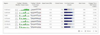 quickly visualize trends in data.

Mainly lot of the issues had been fixed & introduced easy way handle interactive dashboards. Previous versions we used create & configure using SDKs now it gives very powerful interactive dashboard.
Please feel free to ask me any questions you may have to explain.