Narrowcasting Dashboards through email

Last year, our group was tasked with developing a MicroStrategy dashboard that was to show Daily, Weekly, and Monthly views of the business from 5 different perspectives.  The dashboard was to contain 30 reports each with about 3 to 15 rows of data and 10 columns.  The dashboard was to run nightly and needed to be e-mailed to about 75 executives.  This was THE report for the enterprise.   Every solution we came up with was developed all the way through and tested only to find out that there would be file size and report performance problems.  This article will describe each approach, and will finish with the selected solution.

Our initial approach was to attempt to provide the most pleasant user experience possible by building an interactive Flash dashboard.   For two weeks we worked through the dashboard development, layering panel after panel, placing report upon panels at various levels, and manually formatting each and every pixel.   The end product was both interactive and pleasing on the eyes.   We thought we were merely steps away from completion.   We then began testing our product by emailing the dashboard through Narrowcast.  We quickly noticed that the dashboard e-mail was 2 MB, and took about 10-15 seconds to load.   The size of the e-mail was a bit larger than we would have liked, and 10-15 seconds of wait time was unacceptable.  The solution was quickly dumped, and we started to look at our options.

Excel or PDF attachments are always a great option when narrowcasting reports, and the size of these documents are very efficient.   However, this dashboard was required to be viewed directly from the e-mail mainly because of the audience that it was built for.   Shown below are the options in Narrowcast for what can be included in the body of an e-mail.
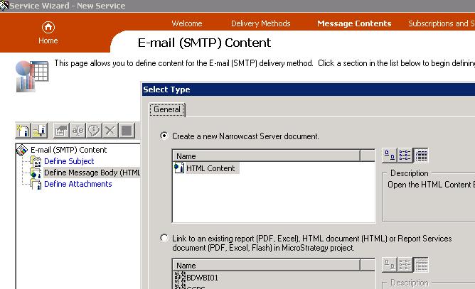
fig31

Our next option was to use Report Service documents, and if that failed we would try out HTML document solutions.   Both options were tried, and although they did deliver the reports in an acceptable format, the file size of the dashboard was still between 1 and 2 MB.   The problem with load time had been solved, but the dashboard was still just a bit larger than desired.   (a Narrowcasted excel attachment of the reports only totalled 100kB)

It was at this time that we started working directly with the Narrowcast server document (the first option in the picture above).  What we found is that server documents are very easy to create.  Basically they involve inserting grid reports onto a blank template as show below:
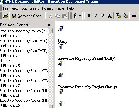
fig32

The end result was a very nicely formatted dashboard/e-mail with a file size of around 800kB.

Although we could have lived with this result, we still felt there was room for improvement.   We knew from experience with other BI tools that similar e-mailed reports were coming through at half the size, so we wanted to investigate a little bit more.  What we found were 2 more settings that could be applied.   First off, under the Advanced Properties of each document object, there was a setting to ‘Improve performance by not preserving the grid reports formatting’, as shown below:
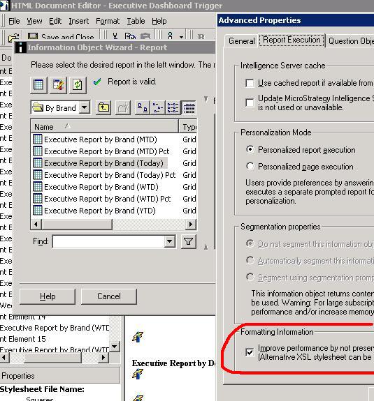
fig33b

Next from each report object’s Document Element Properties, there is a place to specify your own style sheet, which your Narrowcast server should have access to.   It is this setting that will give your report more formatting then just text.   See the picture below that shows we picked the stylesheet called ’Squares’.
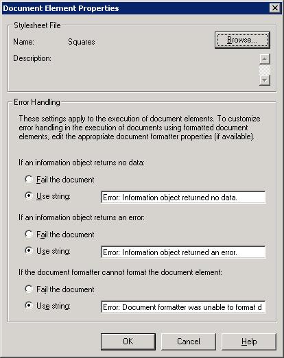
fig34

With these changes, we were able to get the e-mail down to 400kB, and acceptable size, and even a bit better than we expected.   I realize this is alot of detailed technical information, but hopefully, this case study shows the various options of emailing with the Narrowcast server.  If the report does not need to be directly viewable in the e-mail’s body, then attachments are definitely the best way to go, but otherwise, I’m pretty sold on using Narrowast Server documents with style sheets.
What’s new in Microstrategy Dashboard ?

Introduction: The designer can create more flexible data presentations with dashboards than with documents, since more users can be served with a single dashboard. Each user can interact with the dashboard to display only the subset of data they are interested in (using panels and selectors) or only specific attribute elements or metrics (using a selector)

What is a dashboard?
A dashboard is a display of related sets of data on one screen. A dashboard is commonly used to assess company or personal performance work or work group contributions to overall goals of the business. Dashboards summarize key business indicators by presenting them in visually intuitive, easy-to-read, interactive documents.

Provides interactive functionality so users can change how they see the data. Used online rather than printed out.

While Designing Dashboard , you can choose selectors, widgets, panels, and other controls, to create a personalized, custom dashboard that suits your user’s specific needs. Various formatting options such as gradient colors and 3D effects also help you create dashboards with a style appropriate for the boardroom.

Adding interactivity to dashboards:
A key aspect of a dashboard is the interactivity it allows. Interactivity lets analysts dynamically change the data displayed in Grid/Graphs or change other objects on the dashboard.

  • Button bar
  • Analyzing ranges of time: Slider
  • Analysis at a glance: Gauges, thermometers, cylinders, funnels

Gauges

Thermometer

Organizing interactivity features on a dashboard
The result of a user’s interactive selections can affect multiple objects simultaneously. You can design this using a panel stack, which is a collection of panels, each of which can contain groups of objects. Panels help you display only those groups of data that should be seen at the same time.Additional features let the user navigate between panels, and quickly change the display of data within a panel.

Panels and panel stacks
Text field, line, rectangle, image, panel, panel stack, selector, or Grid/Graph object are controls and grouped together put into a place holder is called panel.
A panel stack is a collection of individual panels, stacked on top of each other. Example of Panel Stack
panel stack to provide the Corporate, Regional, and Detail Data “views.” Each view is an individual panel in the panel stack.

Selectors
A selector can be displayed as a button bar, a drop-down list, radio buttons and much more..

Title bars
A title bar is simply an area across the top of a panel stack or Grid/Graph.

  • The title identifies the panel, panel stack, or Grid/Graph.
  • The buttons allow users to minimize and maximize Grid/Graphs in MicroStrategy Web.


Quick switch
Quick switch is a button that allows an analyst to quickly change a Grid/Graph from Graph view to Grid view and back, with a single click.


Widgets

A widget is a type of Report Services control that presents data in a visual and interactive way. You can think of widgets as interactive Flash-only graphs that dynamically update when you select a new set of data to view. The dashboard user can even interact with some types of widgets to manually select a set of data to analyze. A variety of widget types, such as Gauge, Heat Map, and Stacked Area widgets, are available for use in MicroStrategy dashboards.


Graph styles for dashboards
•Gauge •Funnel •Area •Vertical stacked bar •Combination: Line and horizontal bar •Bubble •Pie


Important points to be consider in the interactive dashboards:

  • Layering data on dashboards: Panels & Panel Stacks
  • Providing interactivity to users: selectors
  • Enabling Grid/Graphs to control other Grid/Graphs
  • Providing Flash analysis and interactivity: widgets
  • Enabling transition animations in Flash
  • Adding title bars to Grid/Graphs
  • Quick switch for Grid/Graphs
  • Drilling in documents

Layering multiple dashboards in a single document

It is similar to having tabs created in one web page. It used call Page Bys in the earlier versions of Microstrategy like having Corporate level , Regional level ..

Defining a selector

DHTML style Selectors

Flash Style is how the selector is displayed in Flash Mode in MicroStrategy Web

  • Automatic: Default DHTML type even in the flash style
  • Fish Eye Selector: An interactive style of selector that is displayed only in Flash Mode. It magnifies an item when a user hovers the cursor over it. This style of selector is useful because it allows a user to choose from a large list of elements without having to see all of the elements displayed at once

  • Action Type determines whether the selector displays elements, metrics, or panels.

In non-Flash modes in MicroStrategy Web, a Fish Eye Selector can display as a Grid/Graph (if it was created as a widget) or as a standard selector such as a listbox or button bar (if it was created as a selector).Selector items of a Fish Eye Selector with images instead of Names.

Design View

Understanding and working with widgets:

  • Bubble Grid: Bubbles of different colors and sizes representing the values of two metrics.
  • Cylinder: A simple status indicator that displays a vertical cylinder with fluid in it. The level of the fluid within the cylinder is a visual representation of a single metric value.
  • Data Cloud: A list of attribute elements displayed in various sizes to depict the differences in metric values between the elements.
  • Fish Eye Selector: An interactive selector that magnifies an item when you hover the cursor over it. It allows a user to choose from a list of attribute elements, metrics, or images without having to see all of the elements, metrics, or images displayed at once.
  • Funnel: A variation of a stacked bar chart that displays data that adds up to 100%. It allows a user to visualize the percent contribution of a metric to the whole.
  • Gauge: A simple status indicator that displays a needle that moves within a range of numbers displayed on its outside edges.
  • Graph Matrix: A group of area graphs that display actual values and line graphs that display forecasted values. It allows a user to quickly analyze various trends across several metric dimensions.
  • Heat Map: A combination of colored rectangles, each representing an attribute element, that allow you to quickly grasp the state and impact of a large number of variables at once.
  • Interactive Bubble Graph: A conventional bubble plot that allows you to visualize the trends of three different metrics for a set of attribute elements.
  • Microcharts widget :The Microcharts widget consists of compact representations of data that allow analysts to quickly visualize trends in data.

Mainly lot of the issues had been fixed & introduced easy way handle interactive dashboards. Previous versions we used create & configure using SDKs now it gives very powerful interactive dashboard.

Please feel free to ask me any questions you may have to explain.


Cannot save or move object System Hierarchy with id xxxx and type Hierarchy

Error: Cannot save or move object `System Hierarchy` with id ‘xxxx’ and type ‘Hierarchy’.

Symptoms: When try to create/modify new attribute the above error occurs.

Solution: Download ScanMD (8x), You can use the ScanMD (8x) for version 9 also.

1.  Start ScanMD
2.  Go to Step 3, and click “Add test”
3.  Select TQMS357866.dll

And continue the ScanMD process, Now the above error will get fixed.

Suggestions: Don’t create/modify Schema object in parallel.

Download the file here.

Historical Master Data Attributes

Historical master data attributes are often specially handled when designing an Enterprise Data Warehouse (EDW).   On most BI projects I’ve been on, there is an exercise of sitting with the business in order to determine which attributes are required to be stored historically.  Once this is complete, the requirements are then sent off to the Data Warehouse team for design and development.  How this solution gets architected may be one of the determining factors on whether your project is successful or not, and as a BI team member, sometimes getting your two cents can make your life that much easier.

In the past, I’ve come across three different designs for handling historical master data attributes, with one of them standing out above the rest.    The first design involves placing historical attribute fields directly on to fact tables.  Please remember we are talking about historical attributes that are master data related, and not historical attributes that are related directly with transactions.  The major issue with this comes about during validation and warehouse maintenance if data problems exist.   In order to validate that ETL processes are working properly, one now has to validate every row in fact table to make sure that the  historical attribute is correctly derived.   Also, because this attibute is stored at the fact level, we now have to add this attribute to any new fact tables when needed.  If, for any reason, problems are found in the historical attribute derivation, then the fact tables have to be dropped and reloaded, then re-validated.  Simply put, this solution should not be used if it can be avoided.

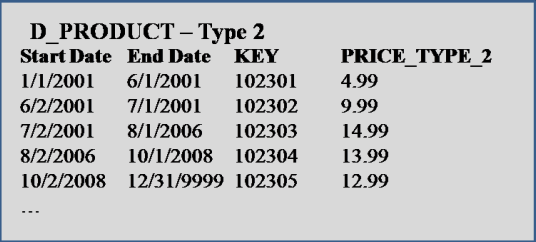
Another design which is quite popular is the use of time based, type 2 dimensions.  This solution involves storing attributes, along with the date range for which those values are valid.   So for example:

fig21a

This solution works just fine in conjunction with a fact table.  To pull the current value of an attributes, we only need to pull the latest record, usually marked with an end date of ‘12/31/9999′.   The only issues that come about with this approach is one, if you store more than one historic attribute on a dimension, then reporting history of those attributes without joining to a fact table cannot be accomplished.    From our example diagram above, notice that the Price Type field is accurately showing history, but Placement Type contains an extra record showing Aisle 5 starting on both 6/1/2001 and 7/1/2001.   One solution for avoiding this, is to store the Previous values for every historic attribute, and then only pull historic data for an attribute if the Prev value <> Current value.  The second issue often comes about when ETL is used to create history in the warehouse.   This may be the only possible solution, but allowing this can ’open up a can of worms’, and now makes validation a much more difficult process.

The recommended solution here actually involves setting rules to the type 2 dimension just discussed.   First off, only track the history of one historic attribute per dimension table.

fig21d

This simplifies the ETL and data storage designs, and also eliminates the confusion when you have more than one historical attribute on a table.    Storing the data in this way not only seems more natural, but also simplifies the validation and maintenance of the historical data.   If a problem is found, then quite simply, fix that problem in one place rather than dealing with more complex ETL procedure used to track multiple historic fields on one table.  Second, don’t use ETL to create history if it can be helped.   ETL created history only starts at the time that the ETL script is implemented, so you never get a full view of history unless it was implemented from the beginning.   Also, ETL created history is difficult to validate, and in the case that problems arise, fixing that history can also be a problem.   Of course, every implementation is different, and you may not have a choice.  All of the information in this article has been tested thoroughly through implementation via MicroStrategy 8.1.

How to cheat MicroStrategy activation

I’ve not tried this, but this just flashed in mind when a friend asked this question while chatting. Basically, he wanted to learn MicroStrategy and I give away my v9 download and trial key. I do not know if I’m doing a license violation by that. I do not have MicroStrategy installed on my local machine and last attempt was a let down.

This is something that I suggest if you want to cheat (you can’t bypass) the 30 day trail. 30 days are not really sufficient to even understand MicroStrategy. MicroStrategy, Inc should think of getting a 3 or 6 month Learning License Serial Key for this mass of MicroStrategy learners and should give next versions Learner License Key to current client under this license.

Coming back to the issue: Use VMWare Server/Microsoft Virtual PC to safely cheat. VMWare is a Virtual OS product (it is much more then that too). You need to have a machine with better hardware configuration. Both are free downloads. MS stuff is free where as VMWare needs site registration.

  1. Create the basic Microsoft 2000 OS image of 25 GB.
  2. Install all latest SP/Patch to it. MS ODBC patches are very essentials for 2000 OS.
  3. Install latest version of Acrobat reader, Flash player, Java Runtimes, IIS and Tomcat Server
  4. Install Eclipse if you do MicroStrategy Java SDK or .net or MicroStrategy ASP.net SDK.
  5. Install Adobe Flex 3 Builder if you do Visualization SDK (Flash dashboard)
  6. Move MicroStrategy installation files into the OS image.
  7. Now make two more copies of this image (for safe backup if you mess with any of backup in future).
  8. Using 30 days Trail Serial Key, install MicroStrategy.
  9. Activate your installation.
  10. Use it for 30 days.
  11. Move back the metadata to host OS. You may not require this step if you already have it in host OS or any machine over LAN. VMWare/Virtual OS image can also access machine over LAN.
  12. Make another copy of image created in step 7
  13. Repeat after step 8.

Disclaimer: This steps are for demonstration purpose only and you hold all legal responsibilities of using this method to cheat License agreement. It may be outright illegal if you do so and may land you in legal trouble. Kindly check your license agreement before proceeding.

Update 2009-08-22 15:38:53: The Trial serial key(s) can not be used indefinately for installations, so one need to turn back time of the VMWare image too 😉